After Creating our Film Poster we then worked on our Film Magazine which we chose as Interview' to create the magazine we first took the photograph on a sunny day of the female lead. The model wore a white dress and bright sixties style makeup to link back to the Intimate magazines routes of Andy Warhols PopArt.The photograph was then edited in photoshop by adjusting contrast and brightness levels, alternative lighting levels. hue and saturation and increasing the blues and greens of the image, the photograph was cropped into a correct front cover shape and the lip colour was cut out using the magic wand tool and once again adjusted contrast. After we had completed editing the photograph we then discussed title graphics. We found an image of the interview logo on google and opened the image on a photoshop document we then picked an orange colour similar to the lipstick worn by the model and used this as the title colour by adding an artistic filter to make the image appear like plastic wrap we coppied and pasted the title ontop of the focal image.finally using powerpoint we created subtitles of articles in that issue of the magazine including a review of 'Intimate' and a reference to the film being compared to classic; Titanic. We added the date of issue and unlike other magazine publications did not use a barcode or price of the magazine as this would be printed on the back of the publication.
Sunday, 5 February 2012
Film Magazine
After Creating our Film Poster we then worked on our Film Magazine which we chose as Interview' to create the magazine we first took the photograph on a sunny day of the female lead. The model wore a white dress and bright sixties style makeup to link back to the Intimate magazines routes of Andy Warhols PopArt.The photograph was then edited in photoshop by adjusting contrast and brightness levels, alternative lighting levels. hue and saturation and increasing the blues and greens of the image, the photograph was cropped into a correct front cover shape and the lip colour was cut out using the magic wand tool and once again adjusted contrast. After we had completed editing the photograph we then discussed title graphics. We found an image of the interview logo on google and opened the image on a photoshop document we then picked an orange colour similar to the lipstick worn by the model and used this as the title colour by adding an artistic filter to make the image appear like plastic wrap we coppied and pasted the title ontop of the focal image.finally using powerpoint we created subtitles of articles in that issue of the magazine including a review of 'Intimate' and a reference to the film being compared to classic; Titanic. We added the date of issue and unlike other magazine publications did not use a barcode or price of the magazine as this would be printed on the back of the publication.
Thursday, 2 February 2012
Film Poster
When it came to creating a film poster for our film project we first had to get the starring roles (Jim Taylor and Georgia White) present at a location suitable for a romantic movie poster this image was taken on New Years Eve in London Covent Gardens when I was with the couple to see New Years in. To fit in with the title of 'Intimate' we positioned the stars in an intimate embrace. This worked really well for the film poster because of the pun of the title.
When it came to editing the photo we used adobe photoshop and began by increasing the contrast of the photo and cropping the image to the correct movie poster shape. We then added a filter of a grain to make the photo less sharp and make it look like its a personal photograph on a disposable camera- suggesting the couple don't have much time together.
After getting the image to look how we wanted we started work on the graphics of the title of the film having previous ideas we changed the font to a typewriter sort, and added gripped hands around the middle T and I suggesting hands around prison bars emphasising the pun of the title of 'intimate' and 'in-mate'. After finishing editing the title we created a new layer and added the title on top of the image discussing whether to put the title on the top of the poster or at the bottom.
We then added text to the photoshop document and adding the names of the starring roles of the film in corresponding places, and fiddle with the colour and fonts.
finally we created our billing block on a powerpoint document changing and altering font sizes and widths to make the block appear genuine we then coppied and pasted the block onto the poster and located it at the top of the image.
Sunday, 29 January 2012
OutTakes
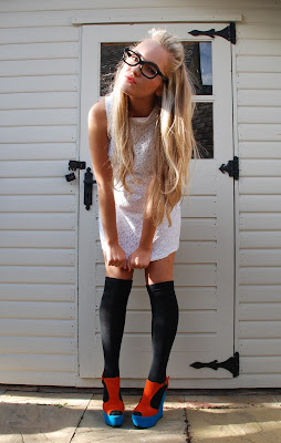
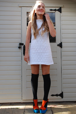
These are a few of the shots we decided not to use for our 'Interview' magazine front cover. When I took these photographs I experimented with all sorts of different angles and expressions, I wanted to create a kind of 60s vibe to the photos inspired by the background of the Intervieww publication being fropm Andy Wrhol. When it came to edditing the final piece we wanted to make it as 'pop art' inspired as possible for a modern magazine.
Monday, 23 January 2012
Romantic Films (History)
Romantic films have been around since the late 19th century and although first silent black and white movies have always involved passion, emotion and the affectionate involvement of two main characters and their journey, they often involve the theme and idea of ‘love at first sight, as well as other themes that romantic films could choose to take on these include; unrequited love, obsessive love, sentimental love, forbidden love, sexual and passionate love and tragic love.
Romantic films have evolved over time yet still often include similar plots and cross-over, most plots involved overcoming obstacles such as physical illness, psychological restraints or family that threaten to break the couples love.

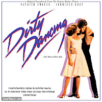
Dirty Dancing is another very iconic movie and is from 1987 although based in the summer of 1963 it is about the development of a crush that the main female role ‘Baby’ has on the dance instructor ‘Johnny’ at her summer holiday resort. She becomes a substitute dance partner and a romance begins to develop although both ‘Baby’s family and the resort threaten to separate the two from being together. In the end of the film and after being fired Johnny returns to the resort to perform the iconic ‘I’ve had the time of my life’ and the problems are resolved.
Tuesday, 17 January 2012
Target Audience
In marketing and advertising, a target audience, or target group is the primary group of people that something is advertised for in order to find out a target audience for a piece of media different marketing techniques are used. for this project we will use a Target audience questionnaire in which will determine who are target audience are. predicting teenage girls.
Target audience questionnaire:
1. Gender?
Male ____ Female___
2. How old are you?
Younger than 10 ___ 10-15 ___ 16-18 ___ 18-21 ___ 21+___
3.What is your preferred genre of movie?
Comedy ___ Horror ___ Fantasy ___ Romance ___ Sci-Fi ___ Musical___ Period drama ___ other please specify ______________
4.How often do you go to the cinema?
Less than once a month ___1-2 times a month ___3-4 times a month___ More than 4 times a month___
5. What television channels do you tend to watch, if any?
BBC___ ITV___Channel 4/E4___Five___Living TV___ TV___SKY___Other________
6. Do you enjoy watching romantic comedy’s and romantic films
Yes )__ No---
7. If so do you like sad romantic films?
Yes --- No---
8. What types of magazines do you read if any?
Cosmopolitan---FHM---Heat---HELLO!---OK--- Q ---TotalFilm---
9. Do you enjoy reading film magazines?
Yes --- No ---
10. What do you find the best way of advertising when it comes to films?
Billboards---Bus advertisements---Freebies---Magazine---Posters---Radio/television interviews with cast---Trailers---None---
Thursday, 12 January 2012
Film Titles
when it came to deciding on what to name our film, the group hit a brick wall, we didn't have a clue. because our film trailer comes from a Romantic movie we wanted to combine love words with words related to prison, giving a hint to what happens in the film. we started brainstorming ideas for this and thought a pun would be a good technique to look at, these are some of the ideas we came up with;
we finally decided on the idea of the name 'intimate' which includes an anagram of the phrase in-mate which i think works really well with the ideal plot of the film. when we create the design of the title we will work on separating the two words so the audience are aware of both of the hidden words coming from title.
these are two of the ideas we had for the film title. i think this technique works really well with the name of the film, and is therefore effective.
Tuesday, 10 January 2012
Magazine Covers
On the market today many film magazines are published to reveal the latest hits on the cinema screen to ensure a large swarm of people go check out the latest' it is seen as a great honour to be mentioned or featured in a top film magazine and generally every film that reaches cinema is mentioned in at least one great film magazine, for our project we are going to create a film magazine featuring our movie and in this post I am going to look at two very different film magazine genres.
first the largest film magazine on the british market
Empire is a British film magazine published monthly since 1989, it is the biggest selling film magazine in Britain and consistently outsells its nearest market rival ‘Total Film’ it reviews both mainstream films and art films but feature articles often focus on large blockbusters. The target audience for tis film is largely male and images as well as the text in the magazine ensure this is relatable.
and now an artistic American magazine
Interview Magazine is the film magazine we will use in our project out of preference, this magazine combines knowledge of the latest films, music and fashion in one magazine and the films it mainly focuses on are indie movies and small productions similar to the one were planning on making. It is an American magazine which was originally founded in 1969 by pop’ artist Andy Warhol. The magazine focuses on conversations between some of the worlds biggest and most influential celebrities, artists, actors, musicians and creative thinkers. The publication influenced our decisions because of the creativeness and design it uses, and influenced our choices by the design of the front covers.
Subscribe to:
Posts (Atom)


